
The First 10 Minutes vs. The First 10 Seconds
How to design the physical store entrance and digital landing page to orient, reassure and guide customers before friction costs conversion.
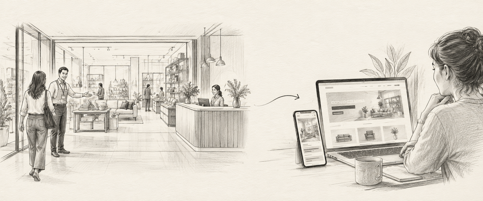
“The biggest gains in retail transformation do not come from chasing complex technology. They come from fixing the basics at the front of the house before scaling complexity downstream.”
When customers walk into a large-format retail store, the first 10 to 15 minutes decide everything: their basket size, their likelihood of returning, and whether their Net Promoter Score lands in advocacy or deep frustration.
Online, the timescale accelerates violently. If the first 10 minutes inside a store shape physical sentiment, the first 10 seconds on a website or app landing page decide whether the commercial journey even begins.
Whether you manage a 20,000-square-foot flagship or a direct-to-consumer digital storefront, the threshold is not a warehouse shelf, a billboard, or a product catalog dump. Its primary operational function is orientation, reassurance, and navigation. When you overwhelm the customer at the entrance, no downstream discounting, promotional signage, or personalized recommendation engine can salvage the transaction.
I. The Threshold Problem: The High Cost of Entry Friction
In physical stores, entry friction typically looks like well-intentioned chaos. Customers step through sliding doors straight into high-pressure promotional banners, passive greeters standing behind barricade-like security stanchions, contradictory ceiling signage, and customer service desks tucked away as a “last resort” for complaints rather than a hub for first help.
In the digital world, websites mirror this exact failure. Rather than acting as a clear gateway, homepages behave like exhaustive catalog dumps: competing carousels, unprompted newsletter pop-ups, dense menus categorized by corporate divisions rather than customer needs, and zero guidance on the simplest next step. Visitors spend twenty to thirty seconds trying to decipher what the brand actually does—and then quietly tap the back button.
The behavioral science behind this threshold failure is consistent across physical and digital environments:
| Threshold Environment | Validated Research Benchmark | Operational & Commercial Consequence |
|---|---|---|
| Physical Store: The “Decompression Zone” | Shoppers require the first 10–15 paces to decelerate, adjust sensory focus, and orient themselves. (Paco Underhill, Envirosell) |
Product displays, flyers, or aggressive sales pitches placed right at the door are completely filtered out and ignored by walking shoppers. |
| Digital Landing: The 10-Second Value Window | Users form an aesthetic impression within 50ms and decide whether to leave within 10–15 seconds. (Nielsen Norman Group / Contentsquare) |
Websites lacking a crystal-clear value proposition and intuitive paths experience bounce rates exceeding 50% before value is ever evaluated. |
• Paco Underhill, Why We Buy: The Science of Shopping, Simon & Schuster / Envirosell Decompression Zone Research.
• Jakob Nielsen / Nielsen Norman Group, How Long Do Users Stay on Web Pages? (Dwell Time & Hazard Curves).
• Lindgaard et al., You have 50 milliseconds to make a good first impression, Behaviour & Information Technology.
• Contentsquare Research, Digital Experience Benchmark Reports.
II. The Physical Store Playbook: Designing the First 10 Minutes
To unlock conversion in large-format retail, the front of the store must be engineered not as a storage area, but as an operational onboarding funnel. Four foundational adjustments consistently deliver measurable returns:
1. Design the First 10 Minutes Deliberately
A welcoming entrance is an operational process, not an informal greeting. Retail leadership must define three exact operational variables: who greets the customer, what they communicate, and where they guide them.
Associates stationed at the threshold should not badger shoppers with sales baskets or interrupt their deceleration. Instead, their role is active orientation: identifying customer intent (browse, specific product search, return, or click-and-collect pickup) and pointing them directly down the right navigational lane.
2. Reposition the Host Desk as a Unified “Solutions Hub”
In legacy store layouts, service desks are tucked away in distant corners, branded as places of complaint and dispute. In high-performing transformations, the front desk is brought forward and repositioned as a “Solutions Hub.”
Whether a visitor arrives to ask a technical question, pick up an online order, initiate an exchange, or book a design consultation, everything starts at this central point. When customers know immediate help exists at the entrance, anxiety dissolves.
3. Establish Clear Ownership Across Handovers
The most vulnerable moment in retail is the transition between staff members. When an entrance host tells a customer, “Someone in aisle four will help you,” and the customer walks into an empty aisle, trust is broken.
A structured entry model eliminates handover ambiguity. The host either introduces the customer directly to a specific department specialist or confirms availability before transferring responsibility. No customer should wander unassisted after expressing intent.
4. Eliminate Silent Friction
Silent friction consists of the operational defects that customers quietly endure or walk away from: contradictory overhead signs, broken ticketing systems, floor layouts that don’t match navigational directories, or shoppers pacing in circles.
When retail operations audits and removes these physical friction points, immediate improvements follow: perceived wait times drop, conversion on assisted sales climbs, and customer satisfaction scores for “ease of finding help” surge.
III. The Digital Landing Page Playbook: Designing the First 10 Seconds
A high-performing landing page behaves exactly like an expert store host: it welcomes, guides, and reassures the visitor in the first few screens—especially when the product involves complexity, configuration, or high financial commitment.
1. Start with a Clear Promise and One Primary Action
The hero section above the fold must immediately and concisely answer three fundamental customer questions:
- Who is this for? Target clarity that speaks directly to the visitor's context.
- What problem does it solve? Clear value proposition in plain language.
- What is the simplest next step? A single, unambiguous call to action.
Whether the next step is “Explore Catalog,” “Compare Options,” “Book a Consultation,” or “See How It Works,” one strong action beats multiple competing CTAs every time.
2. Guide Like a Smart Associate, Not an Unsorted Catalog
Rather than dumping your complete inventory on the homepage, structure 3 to 5 clear, plain-language paths that mirror how customers actually think—not how your internal corporate divisions are structured.
This applies equally to physical goods (organized by use-case, room, or problem), services (structured by business outcome or package tier), or hybrid omnichannel journeys requiring design consultations. The objective is reducing cognitive strain, not dumping data.
3. Build Trust Early Above the Fold
High-consideration purchases demand immediate reassurance. In a physical store, trust is established by a clean floor, well-dressed staff, and active footfall. Online, social proof must be positioned above the fold, not buried in the footer:
- Customer review ratings and verified buyer volume indicators.
- Recognized client logos or industry credentials.
- Customer snapshots, warranty badges, or “Most Selected” recommendations.
4. Design for Mobile Handheld Ergonomics
Most first impressions occur on mobile screens. If search filters are clunky, sticky headers obscure the viewport, or primary action buttons sit outside natural thumb reach, visitors bounce before pricing or craftsmanship are ever evaluated. Designing for mobile means ruthlessly pruning non-essential elements from the first two viewport scrolls.
IV. The Threshold Diagnostic: Physical Store vs. Digital Landing Page
To diagnose where your customer onboarding leaks commercial value, compare your physical threshold with your digital entrance:
| Onboarding Dimension | Physical Store Reality Check (First 10 Min) | Digital Landing Page Reality Check (First 10 Sec) |
|---|---|---|
| Orientation & Welcome | Does an associate actively orient shoppers within 15 paces, or do customers wander aimlessly searching for departments? | Does the hero section state who you serve and what problem you solve in 3 seconds, or are users hit by carousel banners? |
| Navigation Paths | Is aisle signage clear and matching floor layout, or are customers forced into backtracking loops? | Are there 3–5 plain-language customer paths based on intent, or an overwhelming mega-menu matching internal divisions? |
| Reassurance & Trust | Is there a visible, welcoming “Solutions Hub” at the front for questions, returns, and click-and-collect pickups? | Is social proof (ratings, client logos, verified reviews, guarantees) visible above the fold before the first scroll? |
| Primary Call to Action | Does the host facilitate a clear, warm handover to a specialized sales or advisory consultant? | Is there one dominant, clear next action, or multiple competing buttons causing decision paralysis? |
V. What Leaders Must Decide Next: The Threshold Audit
If you are a retail founder, COO, or CX leader looking to lift conversion, step away from executive dashboards and walk your customer entry points under real-world conditions:
- The Physical Walkthrough: Enter your flagship store during peak hours unannounced. Stand by the door for 15 minutes. How many shoppers walk in circles looking for direction? How long does it take for someone to offer competent guidance?
- The Mobile Audit: Open your website on a mobile device with poor cellular connectivity. Give yourself 5 seconds. Can you instantly identify what problem the business solves and what single action you should take next?
The entry experience is your commercial handshake. When you design the front of the house to orient, reassure, and guide, you eliminate friction before it ever compounds into lost revenue.
In the final playbook of this series, we will examine how to diagnose and validate customer journeys across your entire business: turning journey maps from passive boardroom posters into operational decision tools.
Where does your entry experience leak value?
If you had to improve just one thing in the entry experience of your business today, where would you start: physical front-of-store staffing, navigational signposting, or digital mobile landing clarity? If you are scaling a multi-format retail or direct-to-consumer brand and suspect your entry points are leaking customer conversion, let us connect for a focused threshold diagnostic.
Start a Focused Discussion →